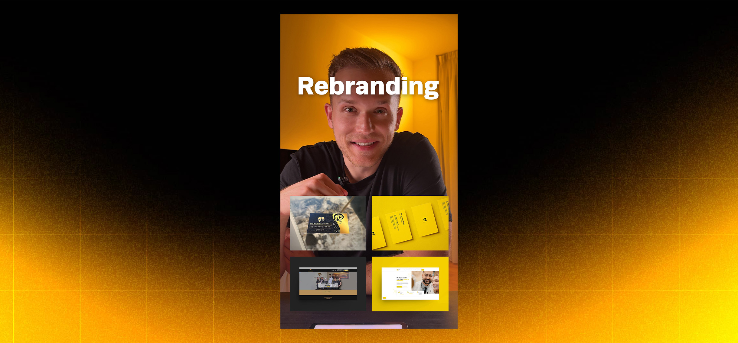
A glow-up in gold: how a simple color swap transformed Mountain Bay Dental

Is there a color combo more old-fashioned than black and gold? Not exactly the look of a modern, exciting dental brand. 👎
When we first stepped into Mountain Bay Dental, the brand identity felt more old bank than trusted dental home. The challenge wasn’t just the practice’s reputation, it was the visual language communicating it.
The challenge: outdated colors, outdated perception
Two features of the old brand perfectly mirrored its negative reviews:
- The color palette, a dull gray paired with dated gold, a combination rarely used today by brands that take themselves seriously.
- The typography, heavy and aggressive fonts with zero warmth or personality.
Everything about it said stay away. The brand lacked approachability and failed to reflect the kind, patient-focused team behind it.
Our approach: a fresh start begins with color 🎨
Our first step was simple but powerful: swap out gold for a brighter, more energetic yellow and put Dr. Anwar front and center.
The new yellow instantly brought life to every touchpoint, from the logo to the website banners. It stood out online, improved click-through rates, and helped shift patient perception from cold and clinical to bright and welcoming.
The dull gray was replaced with a rich black, used strategically to create contrast without dominating. The result was clean, modern, and full of personality, just like the clinic itself.
Finally, we introduced Mazzard, a professional yet playful typeface that brought warmth and friendliness to every headline. Combined with the new color system, it created a brand identity that felt fresh, human, and distinctly Mountain Bay.
The results: first impressions matter
In just 24 months, the clinic went from $270K to $750K in annual revenue. 🚀
Aesthetic updates alone don’t drive growth, but they set the stage for everything else to work. When patients feel confident the moment they see your logo or website, the rest follows naturally.
Mountain Bay Dental’s transformation proved a simple truth: when your brand feels modern, your patients trust you faster.
See the transformation
Watch the full rebrand story, including before-and-after visuals, color palette comparisons, and how it all came together behind the scenes. 🎥


